A Kitchen Connection, located in St. Augustine, FL, has been designing and creating rooms of dreams for over 30 years!
This involves the collaboration of style, design, color, decor, and cabinetry. With Medallion, and KraftMaid, the designs are intertwined with cabinetry selections, offering an array of functional and fashionable options that will spark inspiration & satisfy those special needs.
By browsing through our gallery, you can see the many beautiful and inspiring photographs of rooms and cabinetry detail. When looking at these previous projects of ours, think about which style and design most appeals to you and make note of the designs and photos you particularly like so when you meet with us you can show us the styles you are interested in.
We have also included many things to think about when choosing cabinets, molding, storage, and design management, all listed here: Avoiding Common Problems, Five Basic Layouts, Molding Choices, Storage Considerations, The Work Triangle, Wall Hoods, and Work Centers.
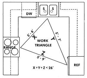
The Work Triangle is the standard configuration used by industry professionals for designing efficient kitchens. The three points of the triangle are typically represented by the refrigerator, range, and sink. Whether you’re planning your own layout or enlisting the help of a professional, use the triangle to check the efficiency of your design,
it’s easy to do. On a piece of paper, simply draw a rough sketch of your kitchen and include the location of your three main work areas, refrigerator, range, and sink. Connect these three locations with lines to form a triangle.
Then estimate the length of each triangle side, in other words, the distance from one work area to the next. The sum of the three sides should be between 12 and 26 feet. If the total is less than 12 feet, the areas are probably too close for comfort. If it’s greater than 26 feet, they’re so far apart that you’ll waste time and effort moving between work areas. As you plan your layout, also keep in mind tables, islands and peninsulas that bisect your triangle, as well as how traffic flow moves through your kitchen.
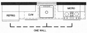
The single-wall or straight kitchen has all work centers along one wall, offering the least efficient kitchen plan, especially for active cooks. However, it’s ideal for smaller homes and apartments.
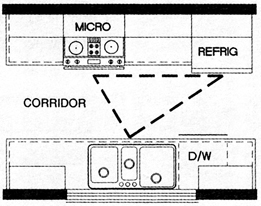
The corridor or galley kitchen offers a single cook efficient workspace with closely grouped work centers on parallel walls, two cooks may be too many for this kitchen, as the shape allows little extra room to work, and household traffic crossing back and forth my interrupt this workflow.
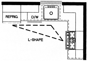
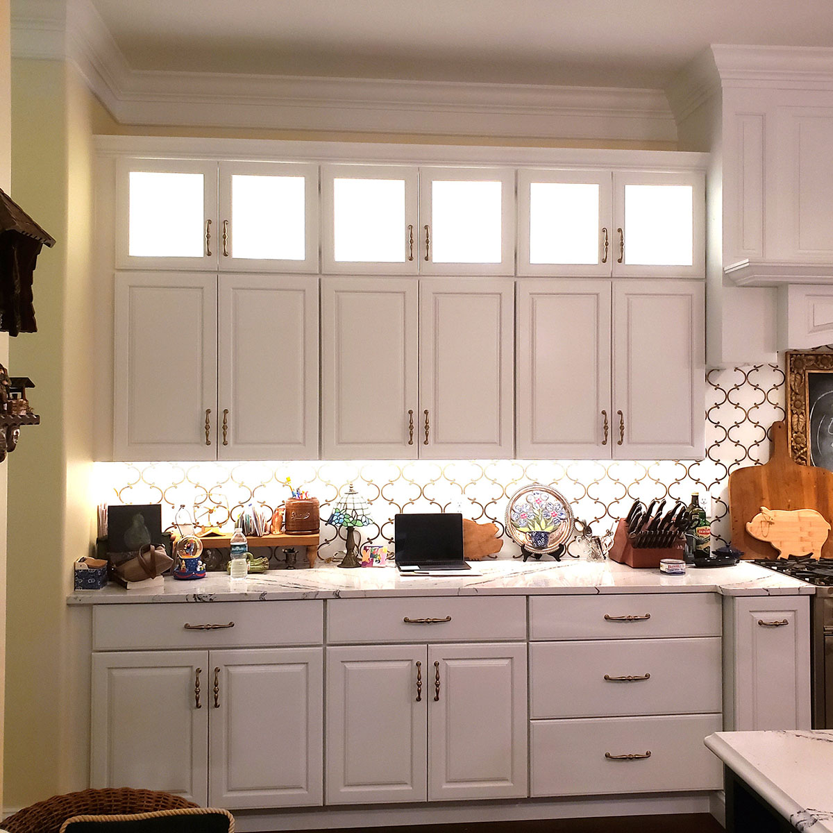
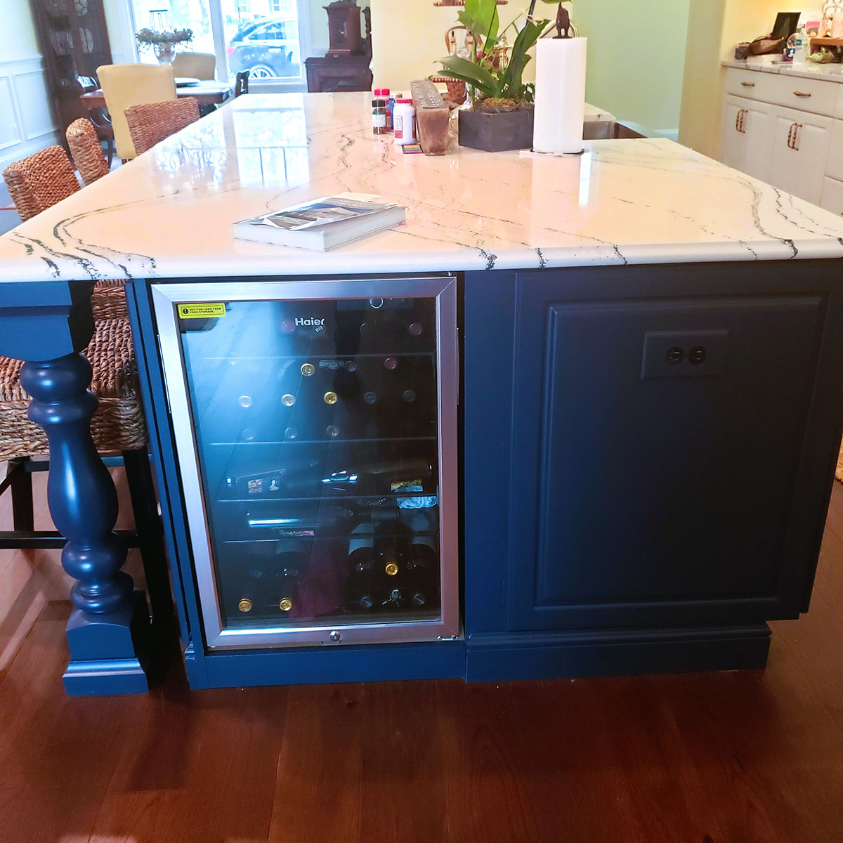
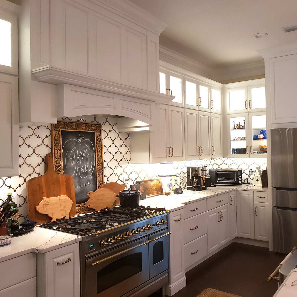
The L-shaped kitchen provides a generous amount of continuous counter space. With work centers on two adjacent walls, a natural triangle forms and traffic generally bypasses the work area. It’s the perfect solution for a kitchen that opens to an adjacent room, inviting interaction between cook and guests, in fact, this design even allows for the inclusion of a dining area. (The above photo is a perfect example of an L-shaped kitchen. Notice how nicely this layout can accommodate a center island with plenty of room to get around.)
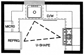
The U-shaped kitchen offers a continuous countertop and ample storage that surrounds the cook on three sides for maximum efficiency. Traffic flows around the work area rather than through it, making the cooking process even easier. Adding an island to an L-shaped kitchen provides the benefits of a U-shaped kitchen. (The above photo is a classic example of a U-shaped kitchen. Cooking is a breeze here, with lots of great counter space, storage space and the all-important work triangle in action.)
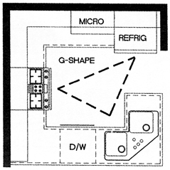
The G-shaped kitchen is really a modification of the U-shape and offers the same efficiencies. This design adds an extra wall of cabinets and appliances in a peninsula or partial fourth wall to keep the kitchen from feeling too closed in. This plan works best when one or two of the cabinet sections are open to adjacent spaces.